Yes, yes it does, thank you for reading.
When it comes to SNK fighting games, one thing that almost everyone can agree about is that they are gorgeous. Super stylish, great character designs, cool effects, and slick animations. At least that was the case until the 3D era came along.
SNK famously couldn't keep up with the cost of creating some of the best spritework ever for KoF 12 and 13, so with 14 onwards, they switched to what has become an industry standard.
This transition was awkward to say the least. KoFXIV in particular almost looked like an early PS3 game, the ones that couldn't have run on PS2, but still didn't know how to take full advantage of the new gen hardware.
Then Samurai Shodown came along. A far more stylized offering that reignited the hopes that SNK can produce a great looking 3D game. Even if it was largely behind its peers, the stylistic choices made it more than tolerable. While KoFXV did indeed show some significant improvements as well, but it was unfortunate enough to come out in the era of great looking 2D fighting games like Guilty Gear: Strive, Granblue, DBFZ, and DNF Duel, and it's much harder to stand out when the plank is set so high.
Fatal Fury is looking to break this streak. The trailers and preview footage look like SNK have finally hit their stride and made a game that wasn't hindered by tech or lack of experience, a game that is more than worthy of standing up to the visuals of its contemporaries.
You can see a great proof of this in the video below. Many SNK fans are probably familiar with Orpheus at this point. They have done quite a few comparison videos that showcased evolution or differences between different titles and characters in the pass, and their new video shows off the dramatic difference between the new Fatal Fury and KoFXV.
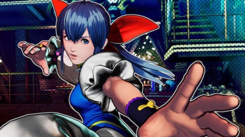
I'd like to outline a few specific areas that improved more than others. The most obvious one has to be with the way the game is lit. The previous two mainline KoF games, and even the latest Shodown are obviously stylized to a degree, but they still went for a somewhat natural and realistic lighting. No hard edges or excessive rim lighting, at most you get cel-shaded silhouettes in SamSho, which serves to make the lines look like they were drawn with ink. Meanwhile, the light and shadow themselves were soft and gradual.
Well, not anymore. Fatal Fury is more than happy to dive into deep, pitch black shadows and to throw in colorful rim lighting to accentuate the character silhouettes and throw in additional detail that really helps out to make otherwise rudimentary 3D models shine. It also fits with the whole comic book aesthetic that can be tracked through the use of screen tones and UI borders that look like they were drawn by a pencil.
The other capital M Major improvement appears when attacks are going out. In my opinion, this is the first 3D SNK game with genuinely fantastic looking special effects. The shattered glass hit sparks are a returning feature from the original Garou, and it looks particularly good with the sharpness that it never had before. The other effects aren't lagging behind. A flaw you'd see in their prior games is that the shapes and shading on the visual effects would make them harder to read and mess up their visual outlines, which made them look less coherent and less satisfying. Well, this time it looks almost as if they animated these hand by hand. It's all crispy and clear.
This applies to the new smears, a core animation technique that you will find virtually everyone, and was used exceptionally well across many SNK games to create a sense of speed and power. Yamazaki is probably a true embodiment of it, but you can see it in Terry's Crack Shoot as well.
Finally, the poses and animations all seem to have received some touch ups to make the game more readable in action and reduce the choppiness that plagued the 3D SNK games. It feels as if some moves have additional transition frames to help it all flow better. In case of cancels, characters will also leave these blue phantoms behind, which is more helpful than you'd think. Yes, there are still some extreme positional changes that happen in a single frame, it's a fighting game with lots of cancels, after all, but those blue phantoms do such an amazing job of bridging the gap between two different animations, since your eyes still perceive the previous state while adjusting to new animations.
All in all, it's very impressive how much work they put into this, and I can't wait to see the game in action! SNK might just be on the cusp of breaking into the mainstream with this game. Great visuals are exciting in and of themselves, but the return to the traditional single fighter format should also be far less intimidating to casuals and newcomers.